
The new Flickr Web Uploadr is the result of a good amount of prototyping, research and good old-fashioned testing across the team that built it. This article goes into some of the details behind the “grid” – the area where photo thumbnails are shown – and sheds a little light on some of the thinking and logic behind the scenes. It’s a little lengthy, but don’t worry, there are pictures!
In April 2012, Flickr started rolling out its new web-based upload UI to the masses. We’re stoked to see it out there, and user feedback has been overwhelmingly positive. The product is an ongoing work in progress and enhancements are still being added, but the core is quite well-established and the experience is a significant upgrade over the one provided by the previous web-based uploadr.
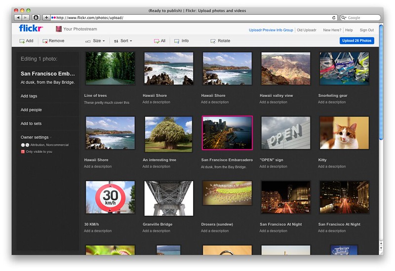
The new Flickr Web Uploadr. It’s powerful, it’s got a dark background, and it’s fast.
The new uploadr has also simply been fun to work on; there are numerous interesting challenges in terms of UI, interactions, performance and sheer scale on the front-end that we had to feel confident in tackling before we were able to commit to moving forward with the project.
Building The Grid: Prototypes
Initial discussions about the new Flickr uploadr weren’t too detailed, because I think everyone already had a pretty good idea of what we wanted to see in a browser: Something more desktop-like, feature-wise (like our older XUL-based Flickr Uploadr application) that would load and show photo thumbnails in a grid arrangement, with a desktop-like selection and batch editing model.
The next step was to start building a prototype in plain old HTML, CSS and JavaScript, and then figure out how many photos we could potentially get into the thing before it broke down. Could the grid handle selection and editing of 1,000 items? 10,000 items? I was cautiously optimistic. A continuous joke I had with the team was that I had built this before, in 2005: The project was an adventurous redesign of Yahoo! Photos, and joking aside, it actually did share a lot of design and interaction elements in common with what we were about to build. In 2005, we were targeting IE 6 and Firefox 1.5, so the landscape has changed a lot in terms of support and performance. Seven years later, it was fun to review some of the lessons and fun bits from the Y! Photos redesign as applicable to Flickr.
Prototype: Fluid Grid Layout
Some of the first prototypes involved building a grid layout, forming a two-column page that would be fluid to the browser width. We wanted to guarantee at least three photos per row would show in the grid, so the thumbnails could scale themselves relative to the browser size in order to fit in the space – easily done via CSS’ min-width and max-width attributes.
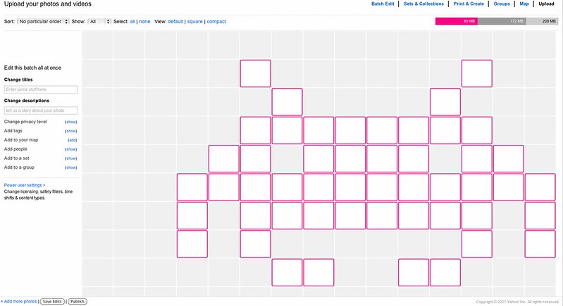
A very early version of the uploadr UI.
The earliest prototypes simply populated the DOM with a few hundred copies of a cloned photo item “template”, to give the idea of what a busy UI might look like. It was mostly just HTML and CSS at this point.
With the grid rendering in fluid form as a series of inline-block <li> elements, the next thing to start was the selection model.
Selection and Drag Events
Building a desktop-like selection and drag-and-drop model can be a technical challenge, given the underlying complexity. As anyone who’s built one of these will understand, there are a whole ton of interactions one must consider and account for between event monitoring, coordinate tracking, drag-to-select vs. rearrange intents, event cancellation, handling of invalid actions and so on.
Selection
In general, all user interactions start with watching mousedown() events inside the grid area. If mousedown() fires within “whitespace”, any existing selection is reset and mousemove() events are then used to draw a selection marquee which compares coordinates to the grid, highlighting items based on basic region intersection logic (for example, xyToRowCol(), points can be checked to see what grid row/column they fall within and thus “from/to” ranges can be established for a given marquee box.) Once a mouseup() event fires, selection can be completed and the mousemove() and mouseup() handlers released.
Testing the selection UI at various grid sizes.
The above marquee drawing and intersection logic is not terribly fancy, but things start to get interesting when you throw in additional positioning considerations like vertical offset from window scrolling (and drag-initiated window scrolling), browser window resizing affecting layout, positioning of the marquee UI vs. coordinates of the underlying grid items and so forth. Keyboard modifiers can also affect selection mode – whether selection is exclusive, additive or toggle-based – so an intersect does not also always mean “select this item”, too.
Marquee selection mode in action.
Dragging + Rearrange
When mousedown() fires on an unselected grid item, selection can immediately change to only that item (unless selection mode is additive or toggle-based via a modifier key.) If firing on an already-selected item, mousemove() is watched for a “threshold” of perhaps 4+ pixels of movement from the original coordinates, at which point “dragging” becomes active.
Once dragging has begun, the selected grid DOM elements are marked with a “disabled” CSS class, greying them out somewhat to indicate drag state, and mousemove() now moves around a cursor trailer that shows the count of items being rearranged.
Rearrange mode, once entered, is similar to the marquee selection mode except that now only a single mouse coordinate is checked in order to determine what row and column is the current “target” for rearrange – that is, what position the user intends to drag the selected photo(s) to. The logic here can get interesting in edge cases, because the user is able to insert both “before” and “after” a given target point based on whether the cursor is on the left side, or the right side of the target.
In terms of the UI, the current drag target simply has an “insert-before” or “insert-after” CSS class appended to it which results in the appropriate “insert point” marker (a CSS border) being applied to it.
Rearrange mode in action.
Once mouseup() fires on a valid rearrange target, the actual rearrange action is applied to both the UI and data model. The underlying JavaScript re-appends the dragged DOM nodes next to their new target sibling node and then splices the photo item array, matching the order of the array to the new layout shown in the UI.
Additional Selection Interactions
A few other use cases to consider: Clicking an item, then shift + clicking another should have the effect of setting an “anchor point”, and selecting a range of items from X-Y within the grid. The user should be able, once setting an anchor point, to “pivot” from that point by clicking while continuing to hold the shift key. (Put another way, holding shift should not set the anchor point when clicking.)
By holding CTRL (or the Command/Apple key on OS X), selection should be additive and toggle-based. My approach to this meant taking a “snapshot” of the selection when marquee drawing begins, and then applying the logic based on mouse coordinates and keypresses with each draw action. This way, you can draw a marquee over and out of an existing selection, causing it to “toggle” and reset accordingly without losing your original state. A new snapshot is only taken once the selection is finalized at mouseup() time.
Demo video: Uploadr Prototype UI
Here is a screencast of a very early version of the Uploadr grid UI, showing the basics of mouse-based selection interactions, scrolling and resizing. By this time, selection events were also firing and updating the “editr panel” area as well.
[flickr video=7177694856 secret=3fb0a325e4 w=500 h=398]
Enter The Keyboard
With mouse events working, additional consideration was given to keyboard shortcuts. We intended to have a UI that supported most if not all of the same selection, editing and rearrange actions that could be achieved via the mouse. An important part to making this work involved watching focus inside the grid, tracking the last-known selected item, and supporting the use of the arrow keys as a means of changing focus between grid items.
Focus-based navigation in the grid is interesting, more akin to mouse movement and hover behaviour. It is intentionally separate from keyboard-based selection (which is invoked with a toggle behaviour via the spacebar, or selection and editing of a single item via the return key.) Using this approach, it is relatively easy to navigate and build up a selection of items via the arrow keys and spacebar.
For rearrange, a cut-and-paste approach was used; CTRL or Command/Apple + X (“cut”) are used to begin rearrange, arrow keys set the target rearrange point, and CTRL + V or return will apply the rearrange at the given target. If active, pressing escape will exit rearrange mode.
Performance: Scaling The Front-End
An important step in the grid prototype, once it was rendering in a fluid fashion, was to see find all the ways in which we could get it to break down. Which browsers were first to choke under the DOM load as more nodes were written out? Was layout and rendering the bottleneck? Were too many events firing? Was the JS engine spending too much time updating the DOM?
After rendering several hundred photos in the UI, we started to see evidence of browsers getting laggy in terms of responsiveness, and CPU + RAM use trending upward. With plans to extend this UI to handle numbers of photos in the thousands, a number of optimizations were made up front including aggressive pruning of the DOM as the user scrolled the page.
In brief, the trick is to create a large page with no content and only generate the DOM to reflect the slice of the whole view being shown.
Given events like window scrolling and resize affecting browser coordinates and DOM layout, we are easily able to calculate and cache the changes as they happen, making quick lookups to determine precisely what range of grid items are in view for the user. A single “page” of grid items can then be generated on the fly, appended to the DOM and shown to the browser. Events like browser resize invalidates the coordinate cache, so the DOM reflows and the grid refresh / display process repeats itself in a throttled fashion when this happens.
Event Throttling: Responsiveness’ Dirty Little Secret
Native DOM events are useful, but they can fire quite aggressively and left unchecked, can really hurt the performance of your application. Scrolling and resize are good examples for the grid case, as we want the UI to respond with an updated display pretty quickly when scrolling – but we know that we only have to show new items when a new row comes into view, which is typically only every 200 vertical pixels. With resizing, we only need to reflow the grid when resizing has added or removed enough horizontal room that we’ve lost or gained a new column.
In short, if you know events will fire often, subscribe to all of them but only do expensive work if there are real changes to apply. Alternately, you could only let resize handlers (for example) fire once every 500 milliseconds and do the work every time, so your handler only fires twice a second in the worst-case scenario.
Cache The Hell Out Of The DOM
This was hinted at previously, but is worth repeating: Get references and read values once, particularly from the DOM, and cache them when initially retrieving and updating them in response to events. If you know what a value is going to be, don’t query for it.
In JavaScript, an internal lookup is far faster than reaching out to query the DOM for attributes like offsetWidth, for example. Simply reading certain attributes of DOM nodes can cause layout and reflow to happen in the browser, which means you’re making the browser do more work for information that is likely unchanged. Thrown into a loop mixed with DOM writes, this makes for pretty disastrous browser performance.
JavaScript frameworks like YUI et al should do their own caching of this data, but I see no downside in grabbing and storing this stuff locally yourself; as the implementer, you have the best idea of what data is most static and what is not.
Additionally, try to read at once and write at once to the DOM; don’t have loops that do a write and then a read, for example. Try to write DOM interactions that follow the browser’s rendering model, minimizing the back-and-forth of layout/reflow/display calculations. Use document fragments to build up collections of DOM nodes, and append them once to the DOM vs. using innerHTML, or – worse – multiple appendChild() calls. Don’t query className when you likely know what it’s going to be; track that state internally in JS, instead, and only write changes out to the DOM.
“Stateful” CSS Class Names
I’ve been a fan of the concept of “stateful” CSS – eg., .is_selected { border: red; } for years. Not only is state consistent, but using CSS in this way also encourages better separation of concerns (and less temptation to add or remove DOM nodes via JS when making changes.)
When you want to grey something out, for example, you may set a disabled property to true on a JS object. That easily translates to a CSS class name change including .disabled {} applied to the relevant DOM node. As a result, your DOM is logically reflecting your JS state. It’s also helpful when troubleshooting, because you can add the class name to nodes ad-hoc when testing UI features.
For the grid’s purposes, every grid item contains all relevant “states” and the markup for those states – selection, thumbnail, progress, overlay icons, messages, errors and so forth. This makes it very easy to change the item’s display with a single, or few additional CSS class names, and minimizes the amount of work JS has to do to update the DOM. It is also trivial to combine states this way, also – e.g., a photo upload that has a thumbnail, but is in a “failed” state because it’s over-size.
While uploading, for example, a grid item may have class="has-thumbnail working selected", then completes with class="has-thumbnail has-fullsize-thumbnail complete" when the upload has finished. All JS did here was update the class name (and while actively uploading, redraw a small progress meter on the item.) Thus, JS/DOM interaction is fairly minimal.
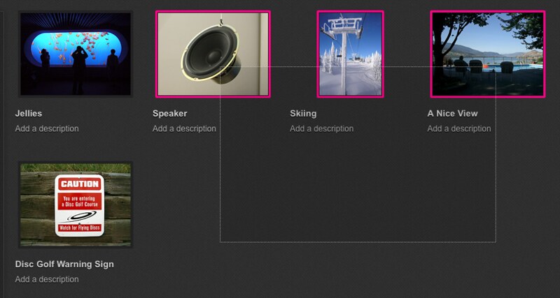
A single CSS change can also completely change the display of the grid, also. “Info view” is one example of this. When enabled, a single additional class on the grid container causes all photo items to show overlay icons with their privacy state, and additional icons if they have tags, are in a set and so on.
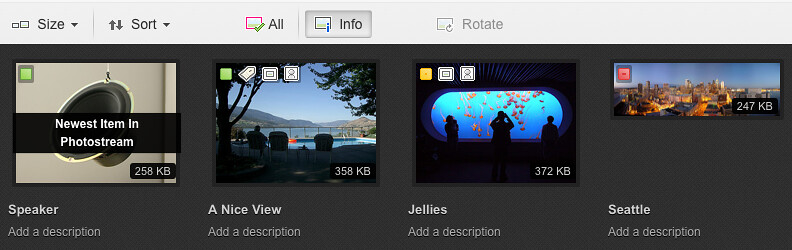
“Info” view, showing overlays with privacy, state and other information.
Broadcast Events FTW
Events are a great way for modular bits of code, written by the same or separate people, to work on separate problems independently. Among other things, the grid listens for events regarding file addition, removal, progress and success / failure states from the upload queue module. The grid generates and fires events itself reflecting changes around selection, editing and arrangement as the user is doing their work, which are picked up by the “editr panel” at left that updates to reflect the selection state. Provided that events are kept as simple notifications and relatively one-way, there is little risk of complex event-related tracing in the unlikely, er – event – that something that goes wrong.
Flickr uses YUI 3 extensively, and we write and plug our application code into the system as YUI 3 modules. In addition to the excellent modular framework approach, we take advantage of the DOM and Event functionality in particular.
In Summary
The grid is only one of several modules that make up the new Flickr Web Uploadr, and is primarily responsible for the display and updating of photo thumbnails, selection, arrangement and basic metadata. There is a lot more going on in terms of JavaScript and network state under the hood, including API calls and permissions; posts highlighting some of the other fun areas are forthcoming.
As it turns out, building a feature-rich browser-based application for millions of people that looks good, is fast and supports many use cases including constraints and unexpected error conditions, can be a challenge. It’s also part of the fun.
Like this post? Have a love of online photography? Want to work with us? Flickr is hiring engineers, designers and product managers in our San Francisco office. Find out more at flickr.com/jobs.